Coldstore Construction
A strategic rebrand for a specialist construction business, built around a familiar penguin that needed to grow up without disappearing.
The brief
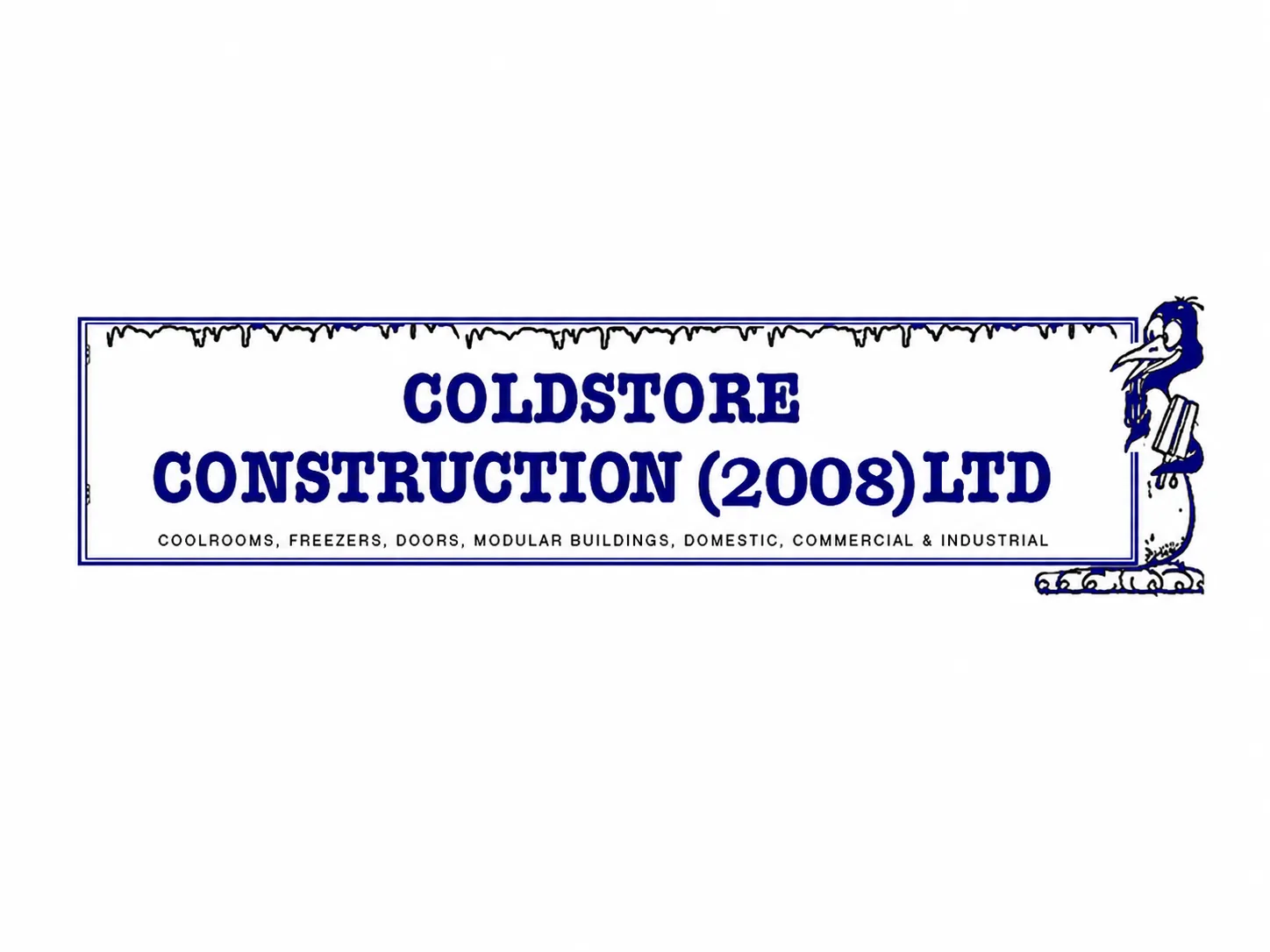
Coldstore Construction already had a logo people knew. It was long, detailed and very literal: icicles, a heavy blue wordmark, a drawn penguin character and a list of services all inside the one mark. It had personality and local recognition, and the client was understandably attached to it.
But the business had moved beyond that look. They needed an identity that could still feel like Coldstore Construction, but with more confidence, more precision and more trust — one that reflected the kind of work they were already doing.
The strategic challenge
The old logo had charm, but it was doing too much. It carried a name, a year, a service list, an ice border and a cartoon penguin in a single lockup. It worked more like a sign than a modern identity system, which made it hard to use across business cards, vehicles, a website, photography and signage — and made the business feel more dated than it was.
The real question was how much to keep. The penguin mattered. It gave the brand something ownable and familiar. Removing it would have been the easier design decision, but not the right strategic one. The better move was to keep the equity and remove the clutter.
The idea
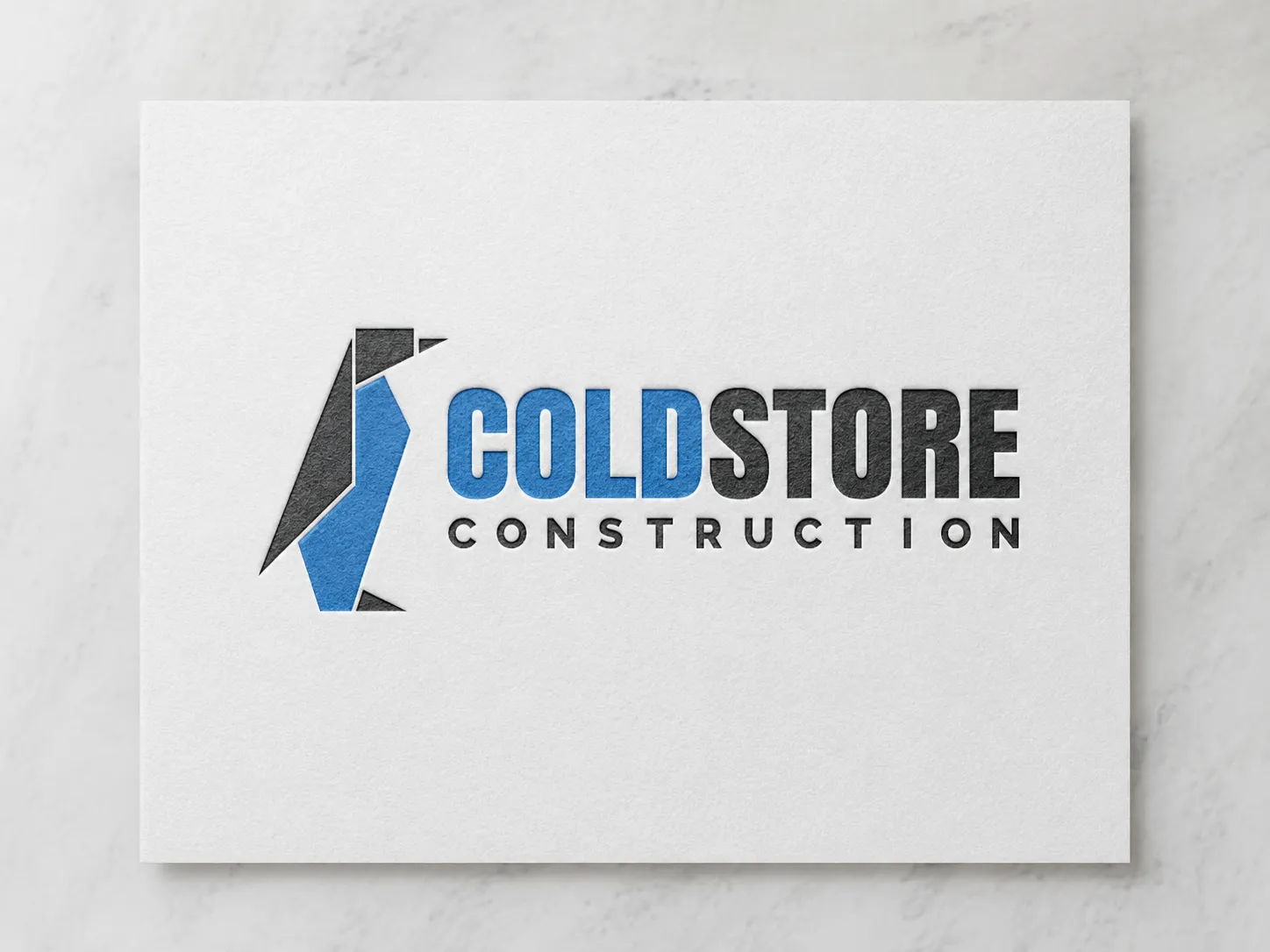
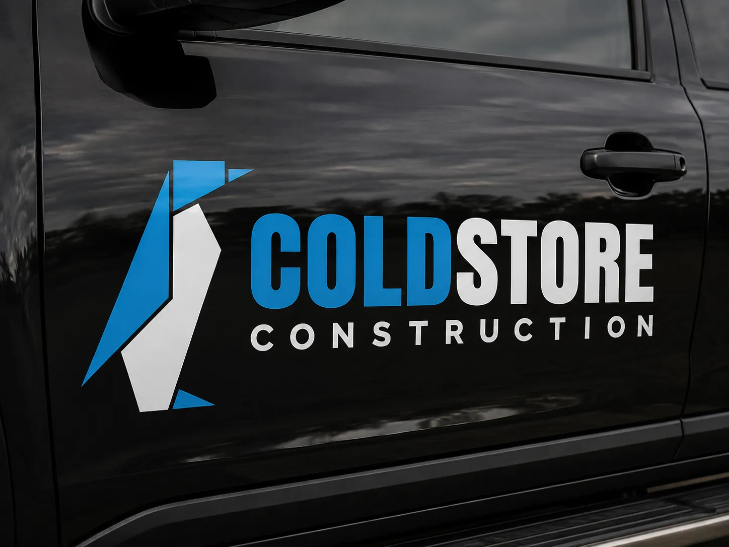
We kept the penguin, but changed its role. Instead of a cartoon character sitting beside the name, the penguin became a constructed mark — hard angles, simple geometry and a precise palette of blue, black and white. It still carries the cold-storage idea, but it now also speaks to steel, structure, panels and construction.
A big part of the work was helping the client move away from the old typeface, and to see that the font was not just a style choice — it was shaping how people read the whole business. We guided them toward a bolder, more legible, more dependable wordmark.
My role
I designed the logo and led the visual direction of the rebrand. A lot of the work was in the thinking, and in the conversation around change. My role was to protect the part of the identity that still had value, then rebuild the rest around a clearer strategic direction — turning a detailed, character-led logo into a sharper system that could work across print, web, vehicles, photography and day-to-day business materials.
The work
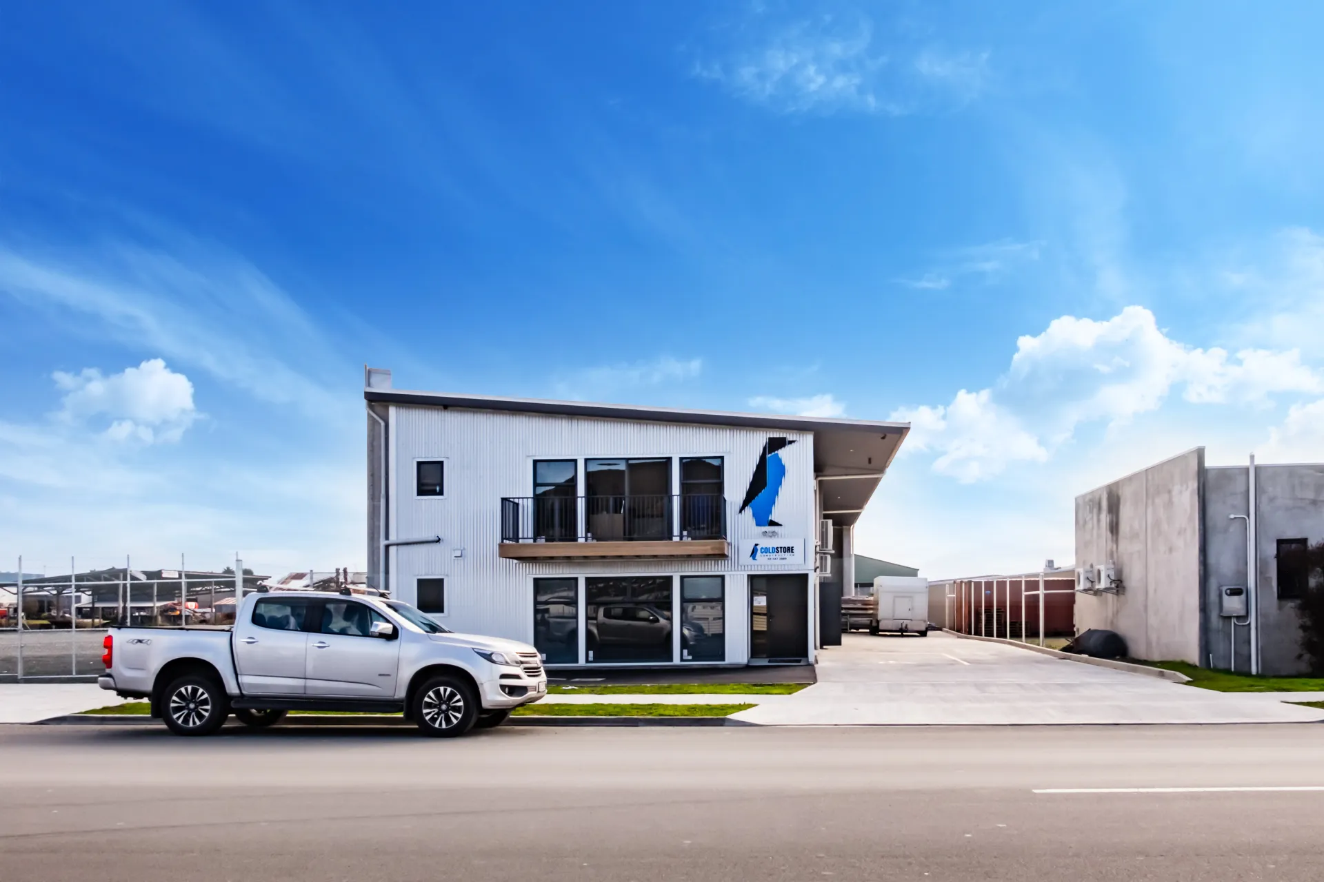
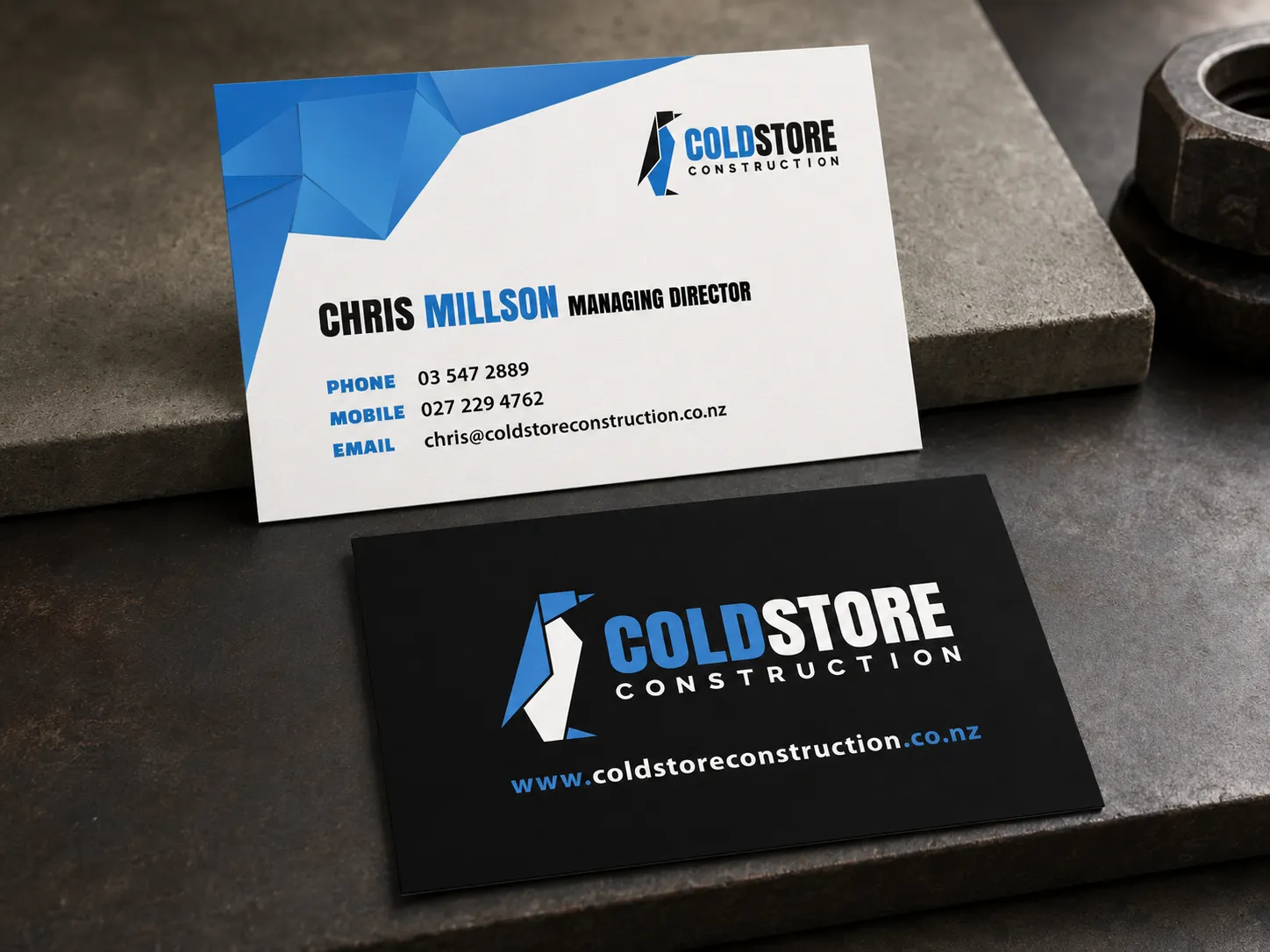
The final identity is built from a sharper penguin icon, a strong wordmark and a simple blue, black and white colour system. The new logo holds its own on a business card, sits cleanly on a vehicle door, works on dark or light backgrounds, and scales down for web without losing clarity.
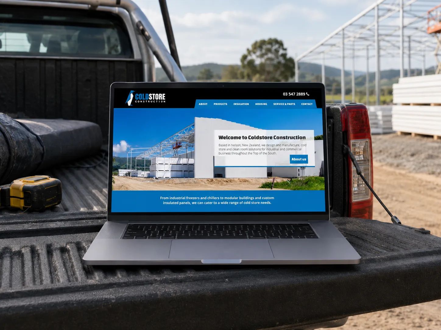
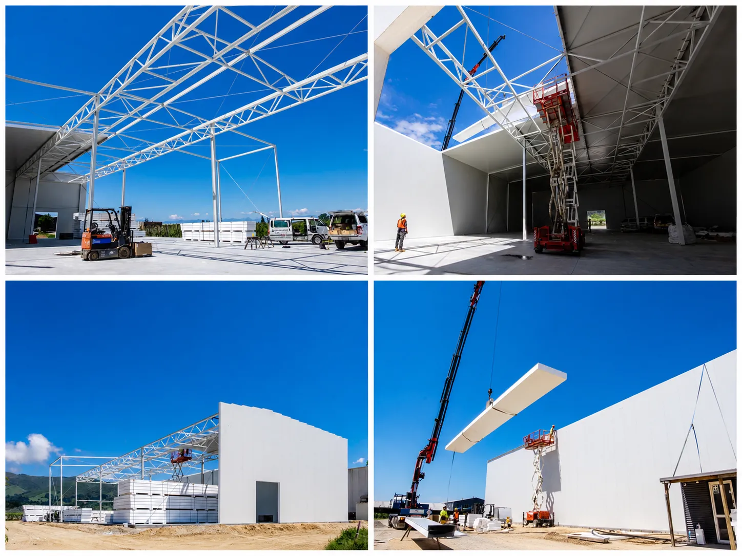
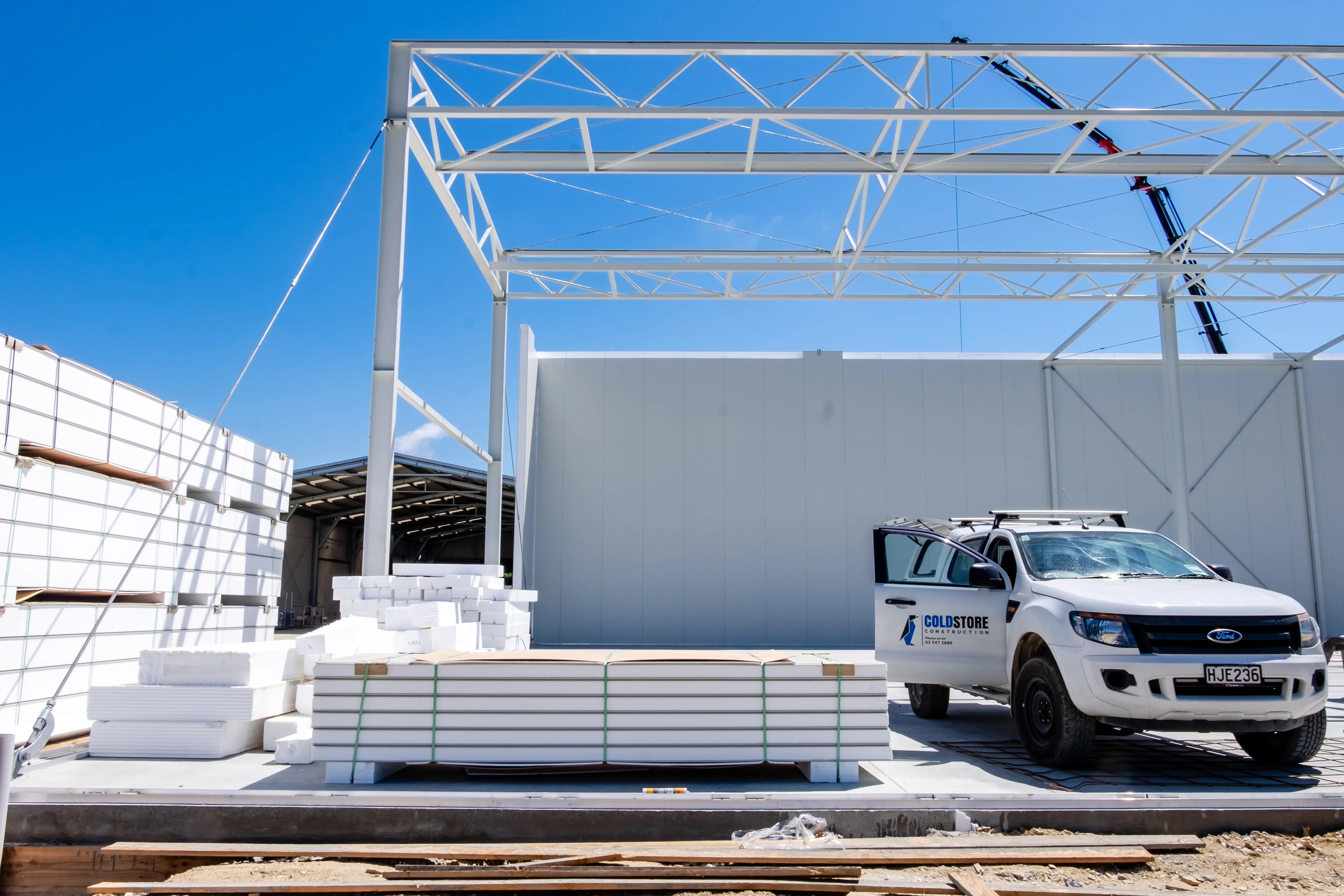
We built the wider system around it — stationery, business cards, website and photography. The website used large project imagery and clear service messaging to make the business feel capable and established, and the photography showed the real scale of the work, from structural frames and insulated panels to site vehicles and installation in progress. Brand guidelines covered logo variations, colour, typography, clear space, minimum sizing and incorrect use, so the identity could be applied consistently after handover.
Working with the client
This project relied on trust. The client did not need to be talked out of their history — they needed to be shown which parts of it still had value, and which parts were holding the brand back. We kept the penguin because it mattered, dropped the parts that made the identity feel busy and dated, and explained why the type needed to change. That balance was the strategy.
The outcome
Coldstore Construction moved from a busy, old-style logo to a clear identity aligned with specialist construction work. The recognisable penguin stayed, but with a stronger job: a symbol of precision, cold storage and engineered construction rather than a character attached to a sign. The result is a more trusted, more flexible and more commercially useful brand that still feels like Coldstore Construction — just with the confidence and clarity the business needed.
What this shows
This project shows my ability to modernise an existing brand without wiping away what people already know — identifying the real equity in the original mark, guiding the client through a sensitive change, and building a full identity system around a clearer strategic idea.