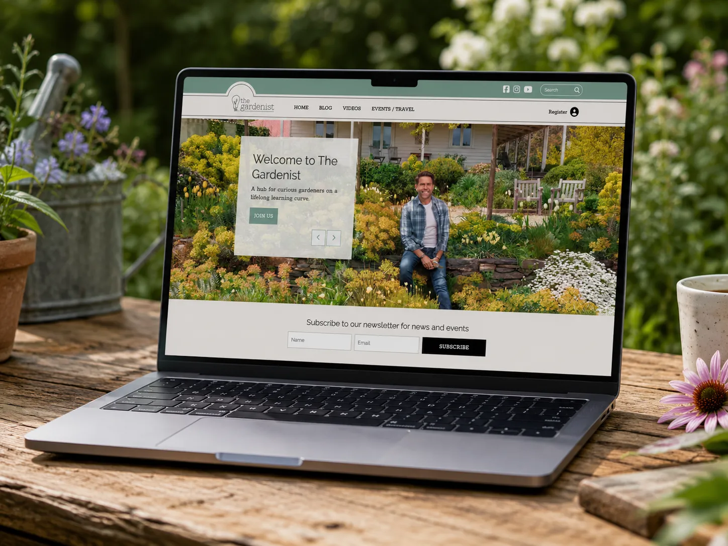
The problem
The Gardenist already had the important things in place: a respected voice, a loyal audience, strong photography and clear brand guidelines. The issue was the website experience.
The site had grown from a blog into a broader business — articles, videos, events, courses, travel, books and a future paid community — and it needed to carry all of that without feeling cluttered or generic. The client came with a clear brief and a defined brand system. This was not a project that needed a new visual identity. It needed careful digital translation: taking an existing brand and turning it into a website that felt polished, usable and easy to maintain.
The idea
The website needed to feel like The Gardenist, not just another gardening website. That meant keeping the experience calm, thoughtful and editorial, while making the paths through the site much clearer. Visitors needed to read, browse, search, subscribe, attend events and understand the value of membership without being pushed too hard.
The approach was to let the content do the work. The photography, writing and voice were already strong — the website needed to frame them properly.
My role
I worked within the supplied brand guidelines and the client’s website brief to design a usable website experience — taking the existing visual language and applying it across a more functional digital system. That included page layouts, article structures, blog listing views, navigation patterns, sign-up points and content areas that could support the different parts of the business. The brief was detailed and prescriptive, so the value of the work was not in reinventing the brand. It was in making good decisions inside the existing system.
The work
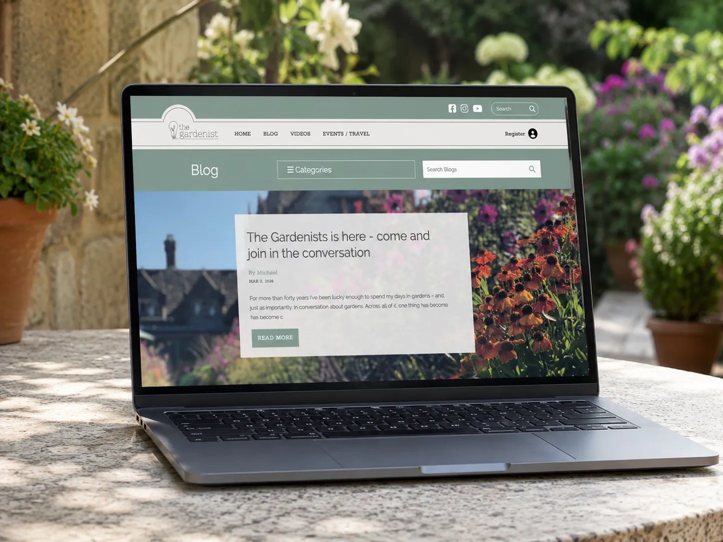
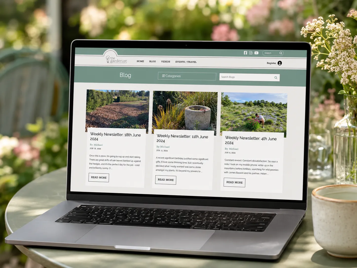
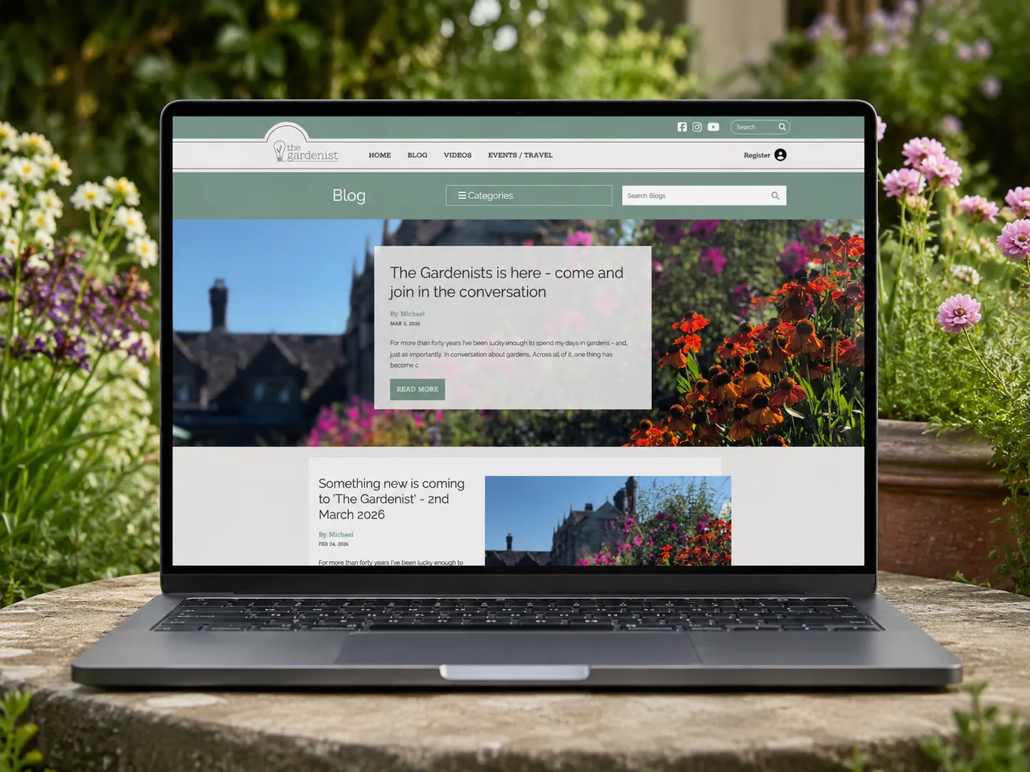
The blog was a key focus. The existing content was valuable, but the browsing experience needed to feel more considered. I designed article cards, category and search areas, featured-post sections and clear, repeatable layouts so older content was easier to find and the site could keep growing.
The article pages were designed to feel spacious and readable, with a stronger editorial structure and clearer supporting actions such as sharing, email and related posts.
Across the wider site, the design had to balance several business goals: growing an engaged community, encouraging email sign-ups, promoting events and masterclasses, supporting video content and making room for future member-only areas. The result gave each of those actions a place without overwhelming the user. It also had to be practical for the team, who update the site in-house, so the layouts were built as reusable sections rather than one-off pages.
The outcome
The finished website gave The Gardenist a more professional and usable digital home. It kept the quiet, thoughtful character of the brand while improving the structure around the content — making the blog easier to browse, giving the photography more room, creating clearer entry points into events and membership, and giving the team a more workable system for ongoing updates.
This project shows the discipline required to work inside an existing brand, follow a clear brief and still improve the experience through layout, hierarchy, usability and restraint.
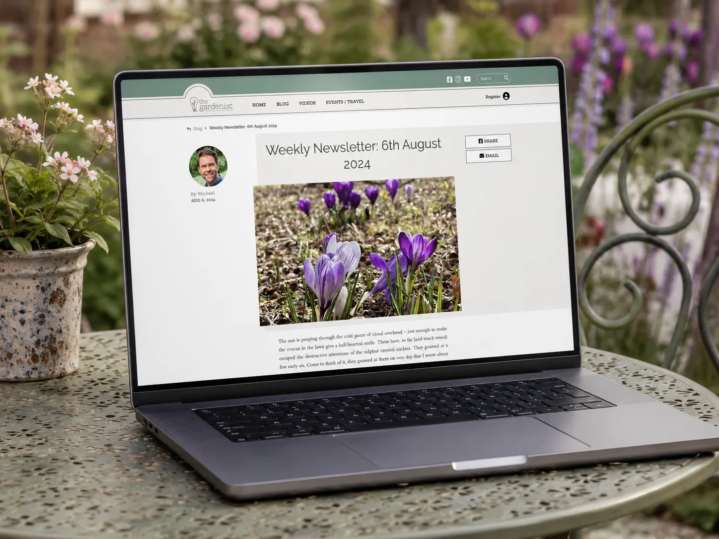
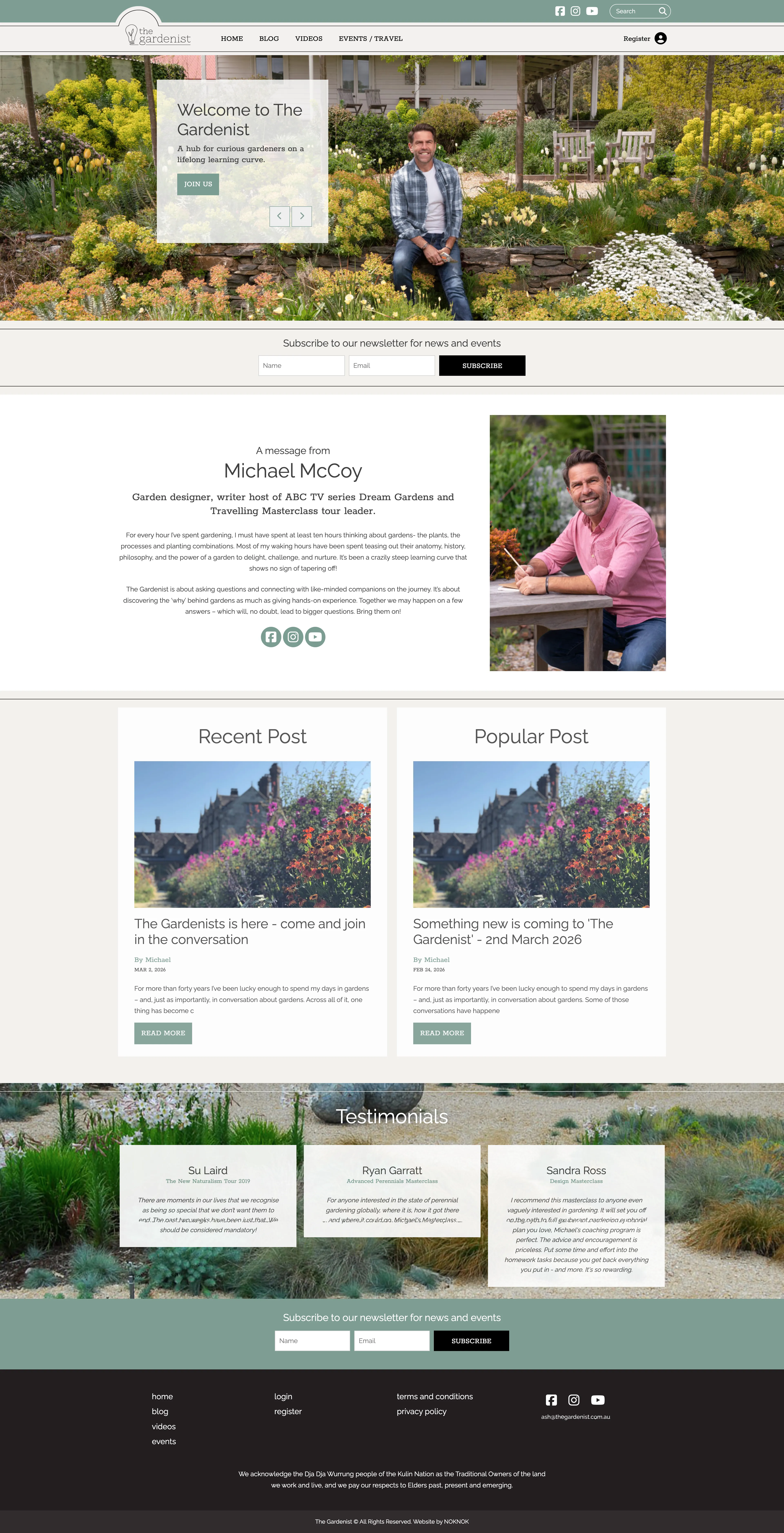
Scroll inside the window to explore the full page ↓
What this shows
This project shows my ability to work within an established brand system and turn a detailed website brief into a clear, usable digital experience. It shows restraint, structure and practical design thinking rather than reinvention for the sake of it.